In this post I talk about the new UI designs, including the game menu, choice menus, and various improvements to user experience. I also give a brief update on the Tonks content update and share some personal thoughts about the project and my art skills.
It’s been about two weeks since my last post about the new interface design, and a lot has changed since then. The new UI is looking sleek and sexy, but we’re not done yet!
Today, I want to talk about some of the other changes we’ve made, like the addition of kinetic text and the new Point & Click system.
First off, the kinetic text. Since we’re already overhauling the interface, we figured why not add some extra flair? Kinetic text is a feature that makes certain words or phrases move and dance across the screen during dialogues. I know what you’re thinking – “Why would I want my text to be moving around on the screen?” And honestly, it might seem a bit silly at first, but trust me, it adds a whole new level of immersion to the game, especially during sex scenes. Normally, we’re limited to just showing the text and having it fade in and out, or use italics or embolden it to make it stand out. With kinetic text, however, we can create all sorts of cool effects. Like, for example, making the words shake slightly during an orgasm, or have them move around in sync with the action on the screen. It really helps convey the emotions and intensity of the scene, and it looks damn good too. Of course, we’ll also need to ensure that it doesn’t get too distracting and detract from the actual gameplay, but I think we’ve found a good balance so far, and no worries, I made sure to add a toggle in the options menu so players can turn it off if they prefer.
Next up, the Point & Click system. This one’s been a long time coming, and I’m super excited to finally see it come together. We’ve been asked to add more locations to explore in the game, and while we could just throw in some generic rooms and call it a day, we wanted to do something more interesting. So, we’ve created a Point & Click system where players can click on objects or characters to interact with them. This will allow us to finally flesh out some of the environments and allow me to draw more than just those four walls of Genie’s office goddamnit!
We’re still working on refining the system, but so far it’s been working pretty well. The main challenge has been figuring out how to make the clicks feel responsive and intuitive. You see, the Ren’Py engine was not designed for this kind of interaction, so we’ve had to work around its limitations. But, after some trial and error, we’ve got a system that feels pretty natural and easy to use. I admit, old menus were a bit clunky, but this new system should be much easier on the eyes and more enjoyable to play with. Oh, and it works with mods, too!
Now, I know some of you might be thinking, “What about the rest of the game?” Don’t worry, we haven’t forgotten about it! We’re still working on all the other aspects of the game, including the new Tonks scenes, which I have started drawing already. More on that later.
You may be happy to hear that the interface is already partially implemented in the game, including some new elements that have not been teased yet. Not only does it look nice, but it also helps us with the rest of the development process, and thanks to the custom UI system, we’ve addressed most of the performance issues that were holding us back before. Since the new interface is now a part of the game, we can start testing it right away, which means we’ll be able to catch any bugs and issues sooner rather than later.
I hope this update has given you a good idea of what’s been going on behind the scenes. Like always, there’s still much work to be done, but we’re making progress and it’s starting to show. Thanks for your continued support, and as always, if you have any questions or concerns, feel free to poke us on Discord.
Today I’d like to do something a little different and combine Dev Blog with Dev Dump. A little something to showcase the inner workings of my process, maybe it’ll interest some of you who want to learn more about the design side of things.
So, let’s get right to it. As you may remember from our last announcement, Witch Trainer Silver has a lot of new content coming down the pipeline. That means more interfaces. But hold up, what’s with the old interfaces, right? That’s the problem.
The truth is, those old interfaces are still (mostly) functional, but they’re not only not fitting the game’s style anymore, they’re also severely limiting the game’s potential. And, quite frankly, they’re an eyesore.
Before any of you take out your pitchforks, know that I am solely responsible for that eyesore, so I am allowed to say that it’s ugly! I mean, I’m not one to cry over spilt milk, but this is an opportunity to do something different, something more visually appealing, and more functional that I simply could not do before due to limitations of the engine, but also my own skills back then.
Now, let’s get back to the current state of things. You see, Witch Trainer Silver’s UI is, well, it’s a bit of a mess, but it’s a mess that despite its many flaws, has a certain charm to it. It’s also something that people love, or at the very least, don’t hate as much as they should. (That’s what I tell myself at night, anyway.)
However, Witch Trainer Silver is also a game that has a lot of potential, and one of those areas where it could use a lot of improvement is in the interface. Now, I know what you’re thinking: “Why should I care about this?” Well, let me tell you, the interface is not just about looks. It’s also about functionality, usability, and how easy or hard it is for the player to navigate through the game. And right now, those things are not exactly perfect.
Now, here comes the part where I’m supposed to tell you that I’ve been working on Witch Trainer Silver for a long time, and I know what I’m doing. And in a way, that’s true, but in a way, it’s not. Because when you’re working on a project for a long time, you can start to take things for granted, and you can also start to make mistakes that you wouldn’t have made if you had been working on it for less time.
So, what do I do? Well, I do what I do best: Break things down into smaller pieces, and then break those pieces down even further. And then, I try to figure out how they all fit together.
So, let’s take a look at the old interface. It’s not perfect, but it has worked for a long time, and it’s not like it’s going to fall apart right now. But still, it’s not the most visually appealing, especially on HiDPI monitors above 720p, because originally we were limited to just 1080×600 pixels.
You may be scratching your head here, as 1080×600 pixels is pretty low, and it’s even lower than some mobile devices today, and I know you’re asking yourself why we chose that resolution, and the answer is we didn’t. When my predecessors started the project, the original game was running on Windows XP in 4:3 aspect ratio, and the resolution was limited to just 600 vertical pixels. As you can guess, it’s not a very pretty thing, especially on modern devices, but I digress.
Anyway, enough of that. You may be wondering what we can do about this. Well, here’s the good news: we can do a lot of things. For one, we can make the interface more visually appealing. For another, we can make it more functional. Lastly, we can finally do some things that we could only dream of doing before because of limitations.
But, I know what you’re thinking now, “How long will this take?” And I’m happy to report that it will be faster than you think. At least, that’s the plan.
Now, I know that not everyone may be as interested in this as I am, but I hope at least some of you will take a look at this and think, “You know what, this actually sounds pretty cool.” Because, at the end of the day, this is what it’s all about: making something that people will enjoy, and that drives me to do what I do.
Without further ado, here’s the new interface design for Mafkin’s Emporium, a work in progress:
As you may notice, it’s a very rough draft, but I wanted to show it to you to give you an idea of what the new interface could look like. These kind of rough design sketches are very common in the game development process, and that is something not many people are familiar with, so I thought I’d take a moment to explain.
Here’s how the design process typically goes for me:
Gather Requirements: In this case, Witch Trainer Silver has a lot of new content coming down the pipeline, so we need to make sure the interface is scalable and can handle the new content without looking too cluttered or messy.
Research and Planning: This involves looking at other games in the same genre, finding out what players like or dislike about their interfaces, and planning how we can incorporate those elements into Witch Trainer Silver’s interface.
Drafting: Once we have all the information we need, it’s time to start drafting the interface design. This is where we take all the ideas we gathered during research and planning and start putting them onto paper. This is usually done in a very rough, unrefined state, and is often just a series of scribbles or rough drawings as seen on the above image.
Engine Integration: As Witch Trainer Silver uses an engine that has some limitations, I have to work with that engine to see how I can make the interface look and function as I want it to, before I seriously start working on designs. Sometimes this means writing code to make it work, other times it means finding workarounds.
Visual Design: This is the fun part, where I get to decide what the interface looks like, and how it will be organised. This involves designing icons, buttons, text, and other elements, and deciding how they will interact with each other.
Feedback and Revision: Once I’ve made a draft of the interface, I show it to the rest of the team and get feedback on how to improve it. This can involve changing the layout, the colours, the icons, or anything else.
Implementation: Once the design is finalised, I start implementing the interface into the game.
At the moment, we’re at step 5, the visual design. As you can see, it’s not finished yet, but we’re further along than you might think.
The above image is what we call a sprite sheet. It’s a collection of images that represent the various UI elements we need to include in the game, like buttons, text boxes, and so on. Once we have these sprite sheets, we can use them to build the interface.
The new interface design will have a lot more detail and visual flair than the old one, and it will also be much more functional, and more suitable for HiDPI monitors and larger screens, but also compatible with lower-resolution screens and mobile devices, or even controllers.
Now, I know that this might not be everyone’s cup of tea, but I hope that at least some of you will be interested in how this works, and maybe even help out with some of the design decisions along the way.
Thanks for listening to my ramblings, and I hope to see you all around on the discord where you can give me feedback on this design.
Hello there fellow Witch Trainer enthusiasts, LoafyLemon here! I’ve got some bits and bobs to share with you all today, so buckle up!
First off, I want to give a massive shout-out to everyone who chimed in on the recent polls and voted resoundingly in favour of spicing up our Patreon with exclusive behind-the-scenes content. Creating these posts is not just fun, it also serves as a good creative outlet to vent our frustrations and accomplishments. I truly appreciate the love and support you’re showing us. You’re the reason we put so much effort into making this project special! ❤️
Now, onto business! As some astute observers already deduced from previous hints scattered across our social channels and git repository, we’re currently knee-deep in polishing the final touches of the Luna Lovegood update. And lemme tell ya, it’s been quite the roller-coaster ride!
One scene in particular, has been keeping me awake at night with its relentless demands. I’m talking about the grand finale of our intimate conversation system – the infamous ‘Talk to Me’ interaction. You know, the one where you, the dashing Genie, coax sexy responses from your loyal witch, Miss Luna Lovegood, depending on how naughty you choose to be. Well, this time, we have decided to spice things up, breaking the boring formula and add some visuals and reactions to it!
If you recall correctly, the last time we dropped some tantalizing teasers, we gave you a glimpse of Luna posing provocatively, splayed on the desk with legs and feet held up high in the air. Quite the image, isn’t it?
However, as always, behind every mesmerizing facade, there lies a sweaty, grubby artist, toiling away ceaselessly in his dark lair, struggling to translate those fleeting visions into tangible form.
I won’t bore you with tedious details about selecting suitable colours, tweaking minute details, or trying to get the feet right until my eyes bleed tears of blood (I already did that before! Although if you’re genuinely curious, feel free to drop a comment below, and I might indulge you later).
Fortunately, after countless failed attempts and plenty of cursing under my breath (maybe not so quietly sometimes), I think I finally cracked the foot-drawing code! Well, sort of. It’s not perfect, but hey, nobody said it has to be.
Of course, the previously showed images in the last dev-dump post are merely a rough draft, just a tiny fraction of the bigger picture. There’s still plenty of polishing left to do before it reaches its full potential. But rest assured, my dedicated team and I are pouring our hearts and souls into this project, ensuring it lives up to the lofty standards you’ve come to expect from us. This scene is the last big part of the update that we need to finish. Currently I’m working on the line art.
Line art is basically the skeleton of your drawing – it establishes the basic shapes, forms, and lines that define each element’s silhouette, volume, and proportion. Think of it as tracing the essential outline of the object you want to render, except with lines instead of pencil strokes.
This phase is arguably one of the most critical parts of the process since it determines whether the final product will look cohesive, balanced, and pleasing to the eye. A solid foundation makes it much easier to refine and polish later on.
For this specific project, I’m using *Paintool SAI 2* vector-based ‘Pen Tool,’ which allows me to draw precise, smooth curves and straight lines with various weight and colour settings. Using vectors instead of pixels has two significant advantages: first, they scale infinitely without losing quality, meaning you can zoom in or out as close as you want, and it will still appear crisp and sharp. Secondly, you can easily manipulate and adjust elements later without causing any distortions or artifacts.
In this case, I start by defining the main silhouettes (such as Luna’s body or the desk) using thick, heavy lines with darker colours, making sure they intersect correctly where necessary. Then I move onto secondary elements like hands, hair, clothes, etc., using thinner, lighter lines with brighter hues. Finally, I refine everything even further by tweaking angles, curves, and points, experimenting with line weights, line widths, line caps, line joins, and various other parameters until I achieve the desired effect. On top of the usual typical line art work, and because the scenes are supposed to be dynamically rendered in the game engine, I also must slice and split layers accordingly to fit within the engine’s scope for posing purposes. Once the line art is done, I will move onto shading, but more on that later.
And finally, before I wrap things up for today, I’d like to address one burning question that’s probably been nagging at the back of your mind like an annoying mosquito: “When can I finally play it?!”
Well, sadly, I can’t reveal our exact timeline publicly (gotta maintain some mystery, don’t I?) But I promise you this – we’re working hard as humanly possible to finish this monster ASAP so that you can feast your hungry eyes on all the steamy, sexy delights Luna and company have prepared for you!
Until next time, take care, stay tuned, and don’t forget – your support means everything to us! Thanks for sticking by us this far; here’s to many more exciting adventures together ahead!
Hey there, Patrons and WTS fans! It’s LoafyLemon here, your friendly neighbourhood adult-game dev. Today, I’m going to give you a sneak peek into the process of implementing CG scenes (hand-drawn smut) in Witch Trainer Silver.
The process starts with sourcing the perfect CG images. We’re quite picky about this *cough* as are most of our users *cough*, as the quality and style need to match the overall aesthetic of the game as closely as possible, which I must emphasise, it’s not easy! Once we’ve conceptualised and drawn the scenes, it’s time to prepare them for integration. This involves splitting layers, resizing, cropping, and optimising the images to ensure they load smoothly within the game.
Next up, we need to decide where and when these CG scenes will appear in the scene they were planned for. It’s all about finding the right balance between storytelling and visual pleasure. We want to make sure that these scenes enhance the (s)experience without disrupting the flow of the game.
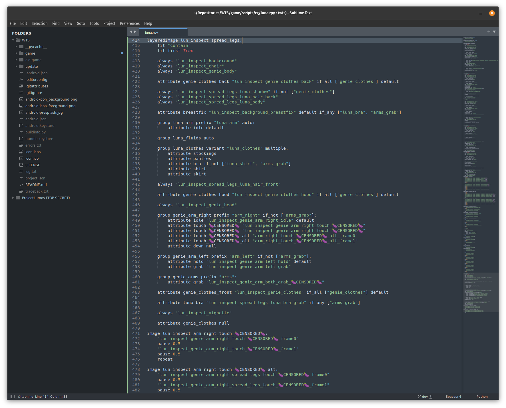
Once we’ve figured out the placement, it’s time for the programming part. I use SublimeText as my code editor of choice because it’s blazing fast, versatile, and has all the features I need. To integrate the CG scenes, I write scripts that trigger the scenes at specific points in the story. These scripts also handle the transition between regular gameplay and the CG scenes, ensuring a (usually) seamless experience for you lads and gals.
Of course, I wouldn’t be myself if I didn’t dive a little bit deeper into the technical side. Historically, I used my own python implementation for CG scenes, which turned out to be less than ideal because I was going against the current, fighting with the engine quirks, instead of following its workflow. Ren’py’s layeredimage feature plays a crucial role in this new process. For those unfamiliar, layeredimage is a built-in Ren’py feature that allows us to create complex and dynamic scenes by layering multiple images on top of each other. This is particularly useful for CG scenes, where we often need to combine backgrounds, characters, and various other elements to create a cohesive and visually appealing image, while maintaining the ability to switch parts of the image dynamically.
Promptly after the image definitions are implemented, it’s time to pose the scenes and see how things fit together. This is a time consuming process and has a huge impact on the overall quality of the scene, involving posing facial expressions, adding visual effects, and setting up animation timers. At times we also draw additional bits and bobs as we go through the implementation to fully flesh out the scene.
After the programming is done, we move on to testing. This is where we make sure everything works as intended and that the scenes are triggered correctly. It’s also a chance to fine-tune the timing and presentation of the CG scenes to ensure maximum impact.
Finally, once everything is working as it should, and we’re happy with the final piece, we upload everything to our git repository.
By the way, we really appreciate your support and feedback, as it helps us continue to improve and expand the game.
That’s a quick overview of how we implement CG scenes in WTS. I personally hope you enjoyed this behind-the-scenes look, and we can’t wait to share more updates with you in the future.
Hey there everyone, time for the latest developer blog update!
I’m really glad to hear that a lot of you enjoyed the recent big update featuring Cho. Your support truly means a lot to me. We faced some major challenges due to engine changes and internal redesigns, but despite the odds being against us, we managed to roll out the update successfully.
One of the really cool things I got to work on for this update, which sets our Ren’py game apart, is the interactive split view for CG images. This was showcased during the Cho retrospection events. Initially, we had plans to keep the scenes separate, but an idea sparked to incorporate both scenes into a single event to add an extra spiciness. Making it happen was a bit of a challenge; I had to dive into the engine and tap into some undocumented functions to make it work just the way we envisioned.
I must’ve gone through three or four iterations before finally stumbling upon the implementation that proved most effective for us, all the while maintaining good performance and features. If you glance at the code, it might not strike you as particularly elaborate, but devising the method of implementation posed its own challenge. You see, ordinarily textures come in standard rectangular sizes, yet we wanted for the displayables to be oddly shaped — think clouds or bubbles. This led us to the need for texture masking, and that’s where the AlphaMask feature stepped in. It was fairly straightforward, but that’s only a portion of the full story.
Next up was cracking the puzzle of exhibiting two images with a cutout, specifically for the bubble, and making them both interactive. The first idea was simple, just make a cutout, right. However, that entailed ensuring no vital elements occupied the bubble’s designated area, which would necessitate altering the artwork to accommodate. I wasn’t keen on that approach, so instead, I conjured up a zorder swap function for image tags, paired with a controller made within the screen scope. This renpythonic solution allowed us to maintain image prediction and rollback support, sans the need for extensive artwork modifications. In the end, it turned out fantastic in my opinion.
Reflecting on the update as a whole, am I satisfied with how it turned out? Yes and no. On one hand, I’m really pleased that we finally resolved the performance issues and tackled major problems like the flawed questing system and other issues. However, I can’t help but feel that we could have, or perhaps should have, added more new content. Maybe it’s just my own thoughts, though. Anyway, let’s keep moving forward.
With all of the above in the past, I can now dive into the meat of the game — the artwork. This time around, both Boppin and I are working on the drawings, while Johnny is pouring his efforts into the writing and scenarios. It’s a refreshing change, if I’m being honest. Don’t get me wrong, I absolutely love coding and consider myself primarily a coder. Still, it’s refreshing to switch things up from time to time and put my drawing skills to the test. I might not have natural talent, but I’m persistent. Over the past three years, I’ve taught myself how to draw, and finally, it’s starting to pay off. Having a grip on both programming and art is incredibly advantageous and it smoothens the process significantly. I understand the limits of layering, where to position elements in the scene, how they’ll interact with the code, and so on. It’s a unique perspective that I’m truly grateful for.
As you’re already aware, the current update in the making revolves around Luna. So, it’s safe to assume that both Boppin and I are busy creating various scenes centred around her character. We’re aiming to create more diverse and modular scenes, giving Johnny the freedom to fully explore his creative writing potential in the more risqué side of things.
Speaking of risqué things, if I spill any more beans about the upcoming scenes too soon, I might just tick off Johnny for letting his secrets slip. So, forgive me for holding back on the tantalizing titbits for now. What I can share with you is that the next update is diving head first into the story and steamy content, leaving the fluff behind. Expect heaps of fresh writing and art that might even make Johnny Sins blush a bit. 😊
Things are progressing smoothly, and we’re not foreseeing any bumps in the road ahead.
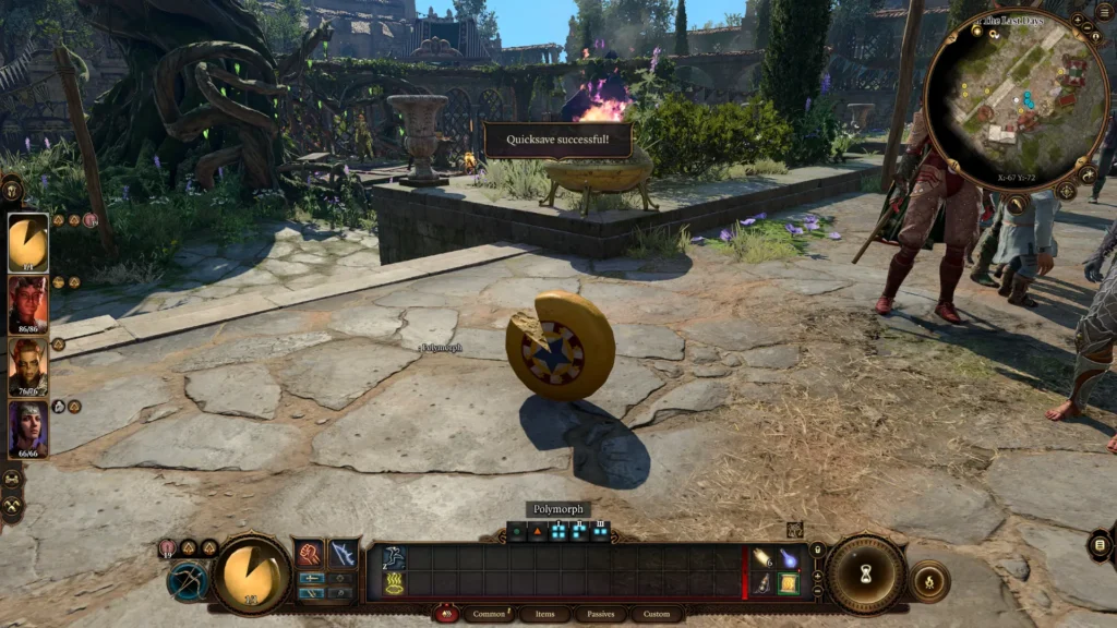
By the way, I hopped into Baldur’s Gate 3 shortly after its release. I’ve been eagerly awaiting that game for who knows how long, and I can confidently say it was absolutely worth the wait. If you’re a fan of both actual cheese and the kind that’s infused into writing, you’ll find yourself right in your element. The writing is incredibly diverse, and every character comes across as vibrant, each with their distinct personality and aspirations. The whole experience feels genuinely immersive. It’s been quite a while since a game has given me this much enjoyment, and chances are, Baldur’s Gate 3 might just clinch the title of my personal game of the year, or who knows, even the game of the decade. That all depends on how I feel about it once I’ve wrapped up my adventure in it.
Guess what time of the month it is? Nope, not that time! It’s time for another devblog, woohoo! Hope my last entry didn’t put you into a coma. Don’t worry, this one will be short and sweet, I promise.
So, as you already know, we’ve rolled out a pre-release update for you cool beans to help us squash those pesky bugs, while we continue adding all the juicy stuff we planned for this update. Gotta say, I was expecting a ton more issues to be reported. Either our hard work paid off, or you lot are just being sneaky and not telling us everything. Time will tell, I suppose. 😅
Speaking of adding content, the recently teased Cho CG has been implemented, and I’m currently putting the finishing touches on yet another Cho CG that has not been teased yet. It’s been a nice change of pace from dealing with all the technical stuff and fixing bugs. We might post another preview, or two, before the final release to make the wait time more bearable.
Now, I know what you’re thinking. “When the heck are they gonna release this update?!” Trust me, I’m wondering the same thing! 😄 But hey, no worries. I just need to implement two more scenes and tackle a couple of bugs, and then we can start wrapping things up. It should be much quicker since all the back-end changes are already finished. And guess what? Johnny has gone bonkers with Hermione content again. There’ll be loads of new stuff to explore throughout the entire game. Cool, right?
While Johnny and I are knee-deep in the current shenanigans, Boppin is already cracking on with the next update. Talk about being ahead of the game! By the time we wrap up this one, we’ll have a treasure trove of artwork to dive into. All you Luna fans out there better get ready to party, ’cause there’s gonna be some serious Luna love coming your way.
And there you have it, folks! We’ve reached the end of this week’s devblog. Nice and snappy, just like I promised. See, I can totally deliver on my word!
Until next time, stay awesome!
Cookies
We serve cookies. If you think that's OK, just click "Accept all". You can also choose what kind of cookies you want by clicking "Settings".